pacman::p_load(tidyverse)1 A Layered Grammar of Graphics: ggplot2 methods
1.1 Getting Started
After reading this page, you can draw this chart by yourself!

1.1.1 Install and launching R packages
The code chunk below uses p_load() of pacman package to check if tidyverse packages are installed in the computer. If they are, then they will be launched into R.
1.1.2 Importing the data
exam_data <- read_csv("data/Exam_data.csv")head(exam_data, n = 10)# A tibble: 10 × 7
ID CLASS GENDER RACE ENGLISH MATHS SCIENCE
<chr> <chr> <chr> <chr> <dbl> <dbl> <dbl>
1 Student321 3I Male Malay 21 9 15
2 Student305 3I Female Malay 24 22 16
3 Student289 3H Male Chinese 26 16 16
4 Student227 3F Male Chinese 27 77 31
5 Student318 3I Male Malay 27 11 25
6 Student306 3I Female Malay 31 16 16
7 Student313 3I Male Chinese 31 21 25
8 Student316 3I Male Malay 31 18 27
9 Student312 3I Male Malay 33 19 15
10 Student297 3H Male Indian 34 49 371.2 Plotting different chart types
1.2.1 Bar chart
p1 <- ggplot(data=exam_data,
       aes(x=RACE)) +
  geom_bar() +
  ggtitle("Number of students by Nationalities")
p1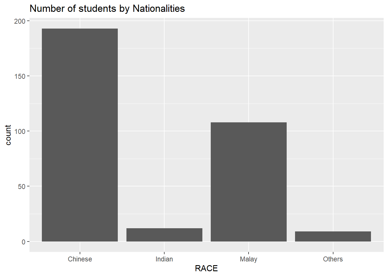
p1 + coord_flip()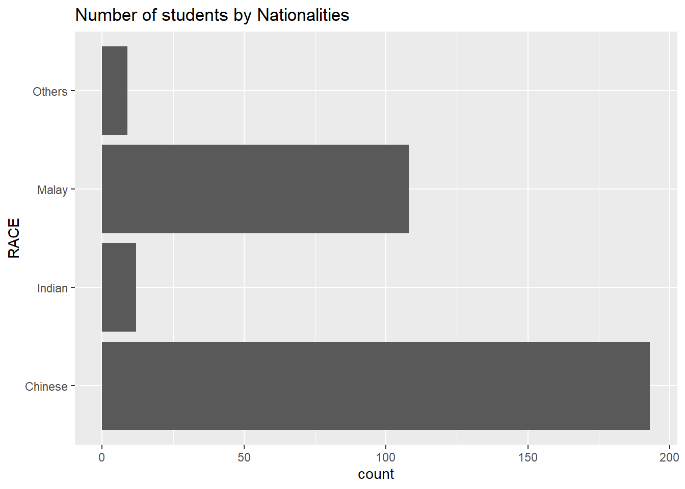
p1 + theme_linedraw()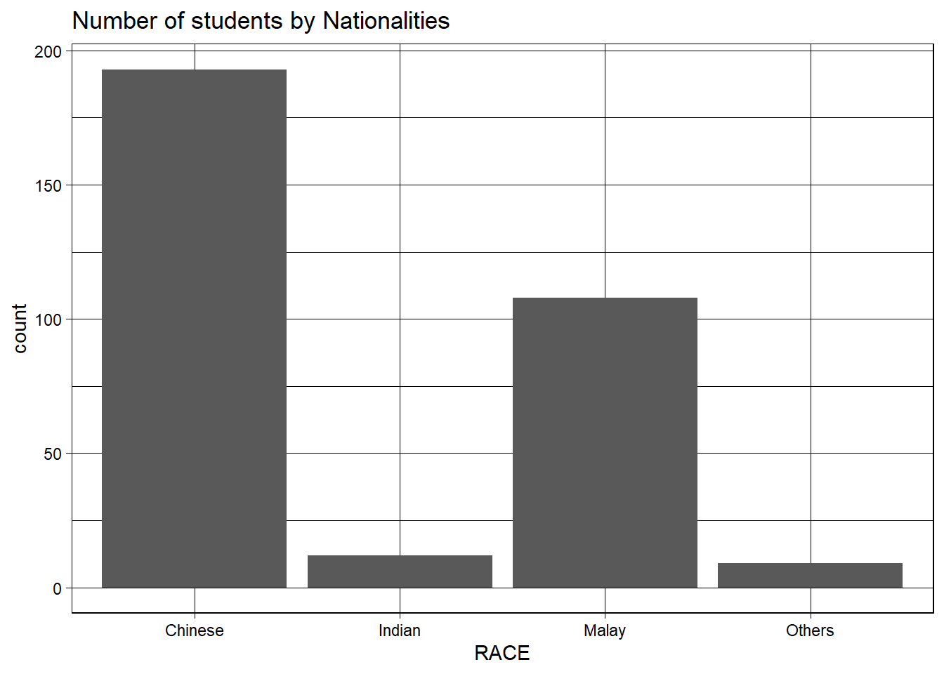
1.2.3 Histogram chart
ggplot(data=exam_data, aes(x = MATHS)) +
  geom_histogram(bins=10,
                 boundary = 100,
                 color="black",
                 fill="light blue") +
  ggtitle("Distribution of Maths scores")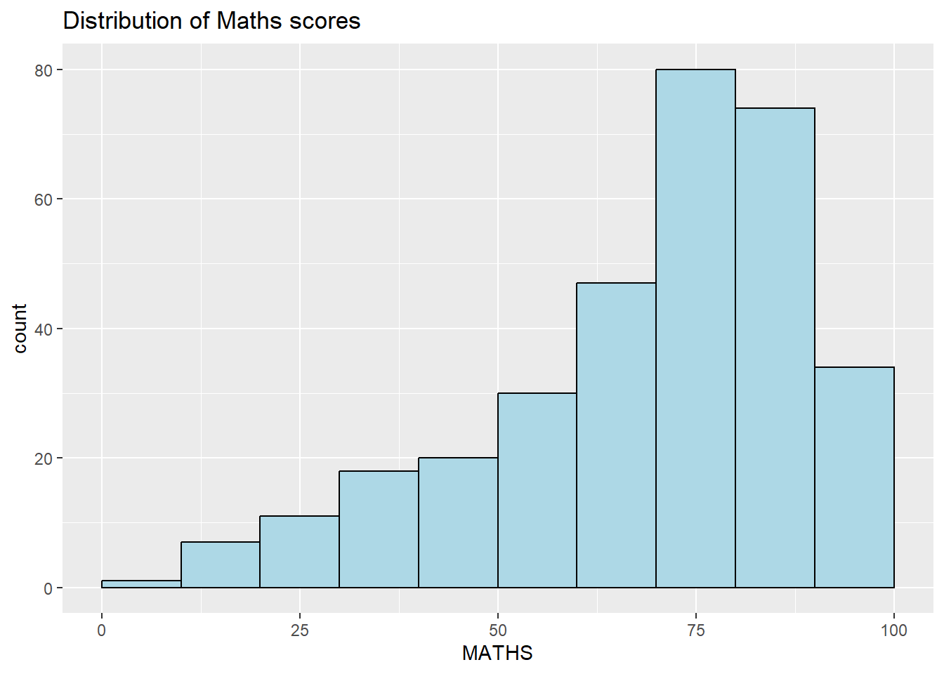
ggplot(data=exam_data,
       aes(x = MATHS)) +
  geom_dotplot(binwidth=2.5,
               dotsize = 0.5) +
  scale_y_continuous(NULL,
                     breaks = NULL)  +
  ggtitle("Distribution of Maths scores")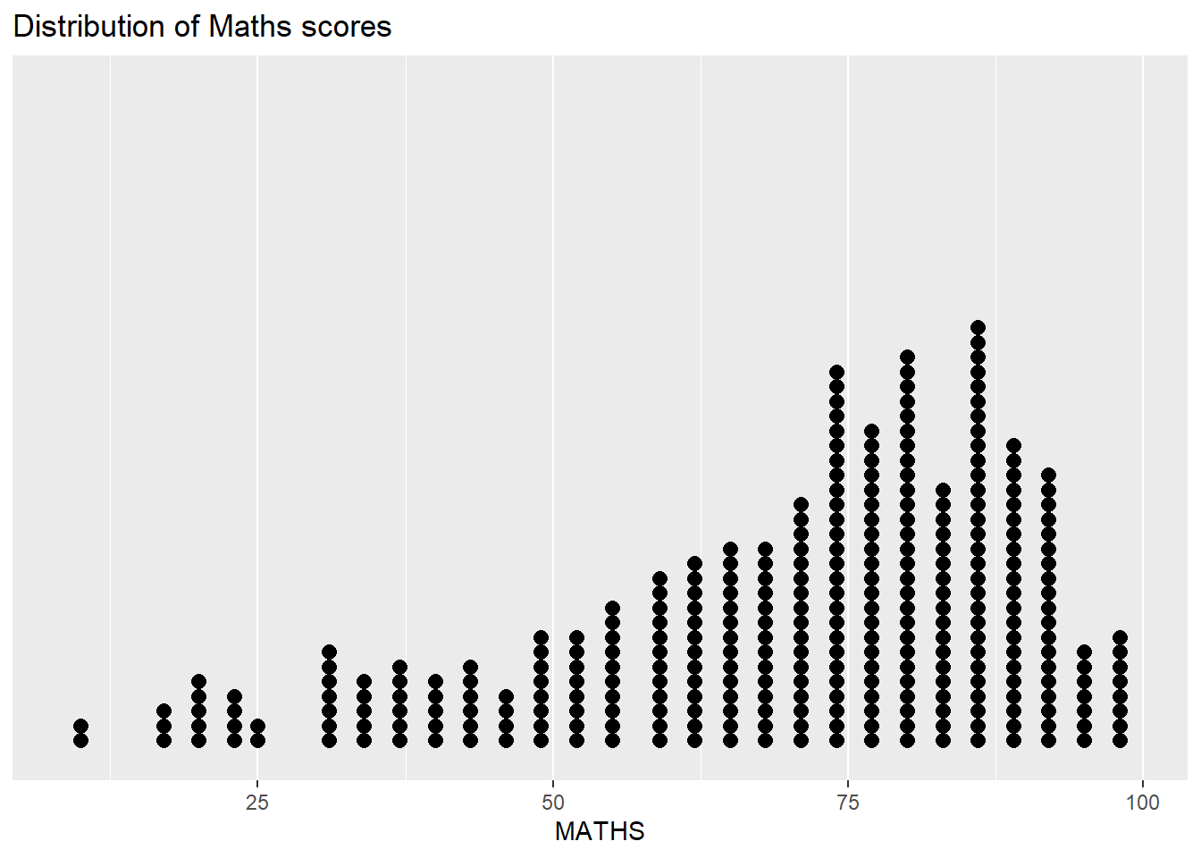
ggplot(data=exam_data,
       aes(x= MATHS,
           fill = GENDER)) +
  geom_histogram(bins=20,
                 color="grey30") +
  ggtitle("Stacked Distribution of Maths scores by Gender")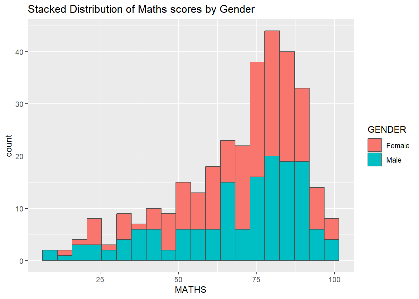
ggplot(data=exam_data,
       aes(x = MATHS,
           colour = GENDER)) +
  geom_density() +
  ggtitle("Density of Maths scores by Gender")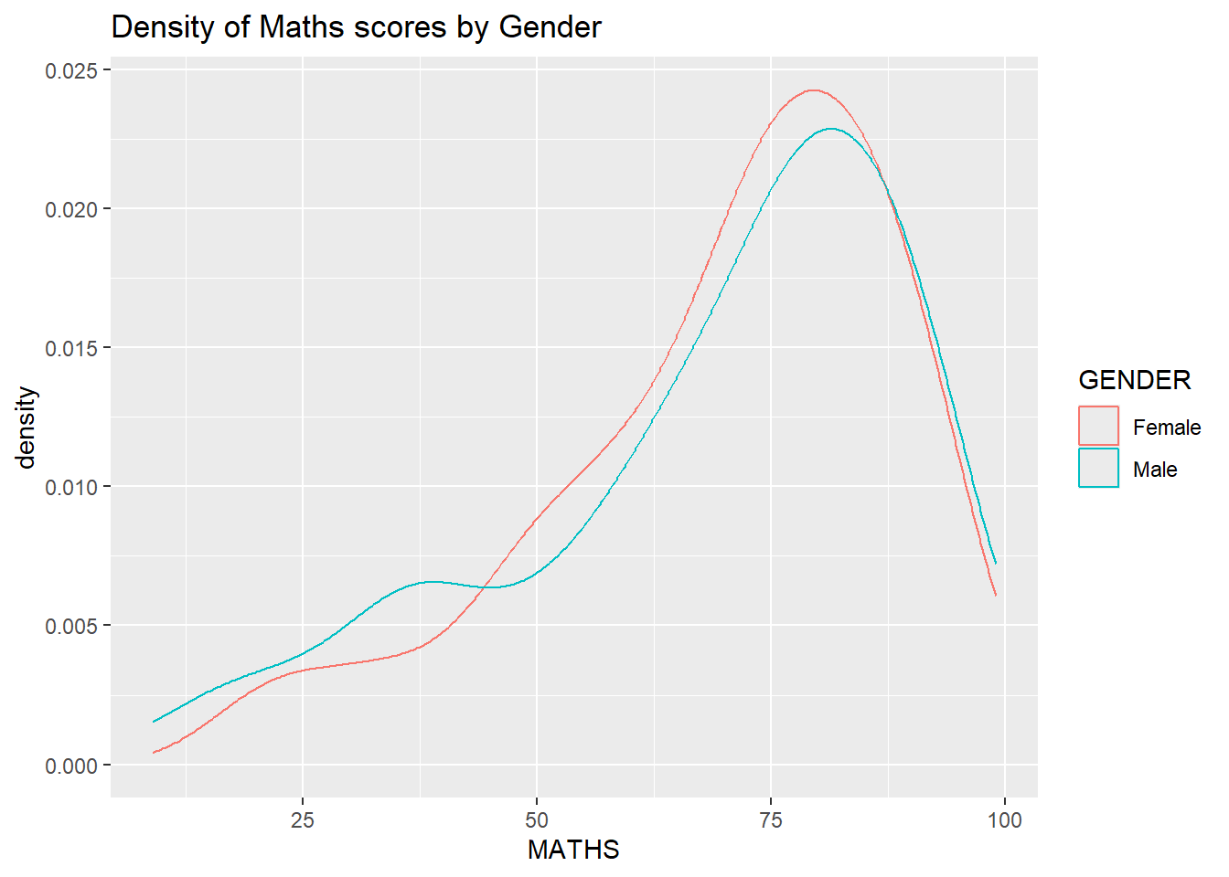
1.2.4 Box plot
ggplot(data=exam_data,
       aes(y = MATHS,
           x= GENDER)) +
  geom_boxplot(notch=TRUE) +
  ggtitle("Boxplot of Maths scores by Gender")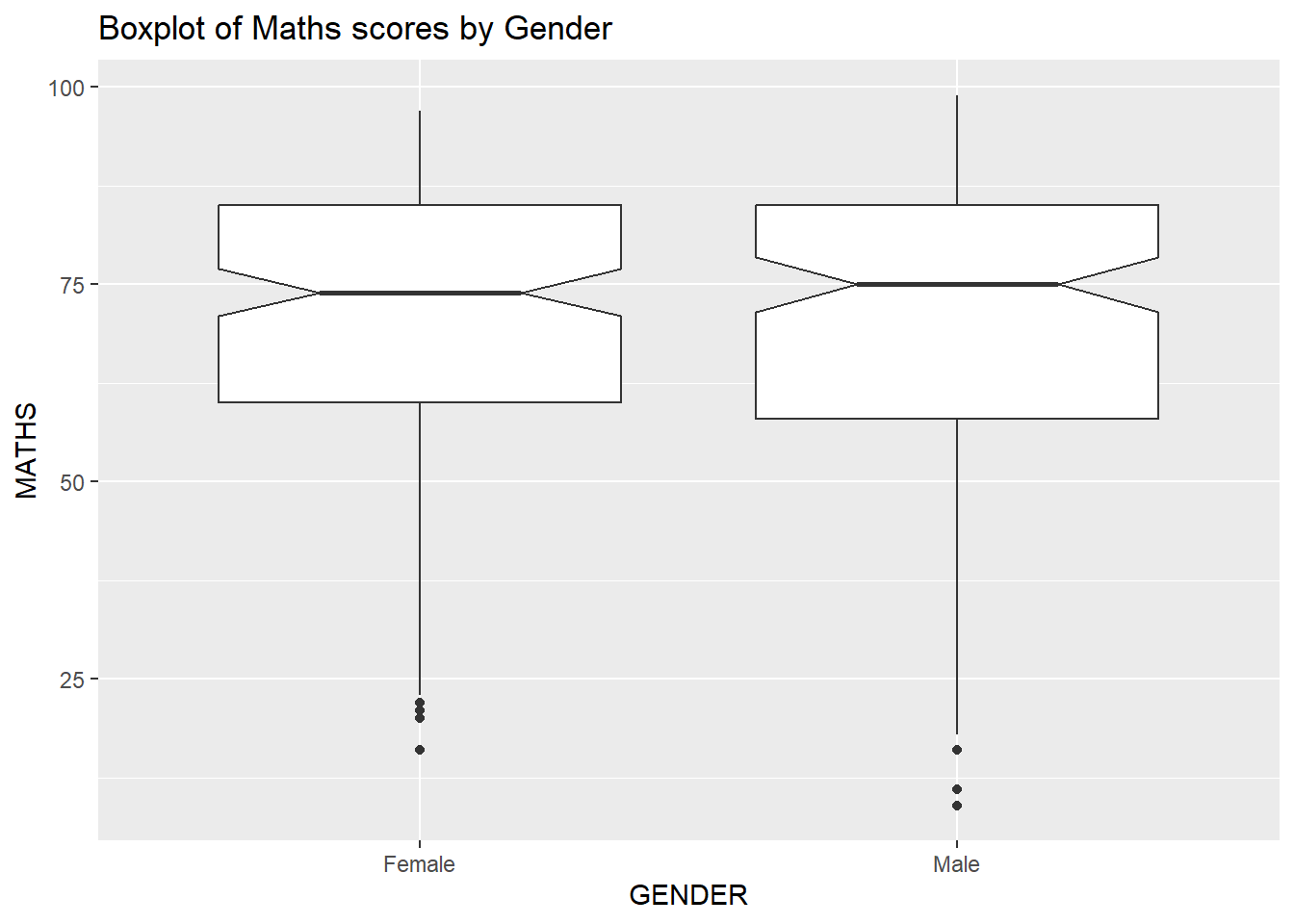
1.2.5 Violin plot
ggplot(data=exam_data,
       aes(y = MATHS,
           x= GENDER)) +
  geom_violin() +
  ggtitle("Violin plot of Math scores by Gender")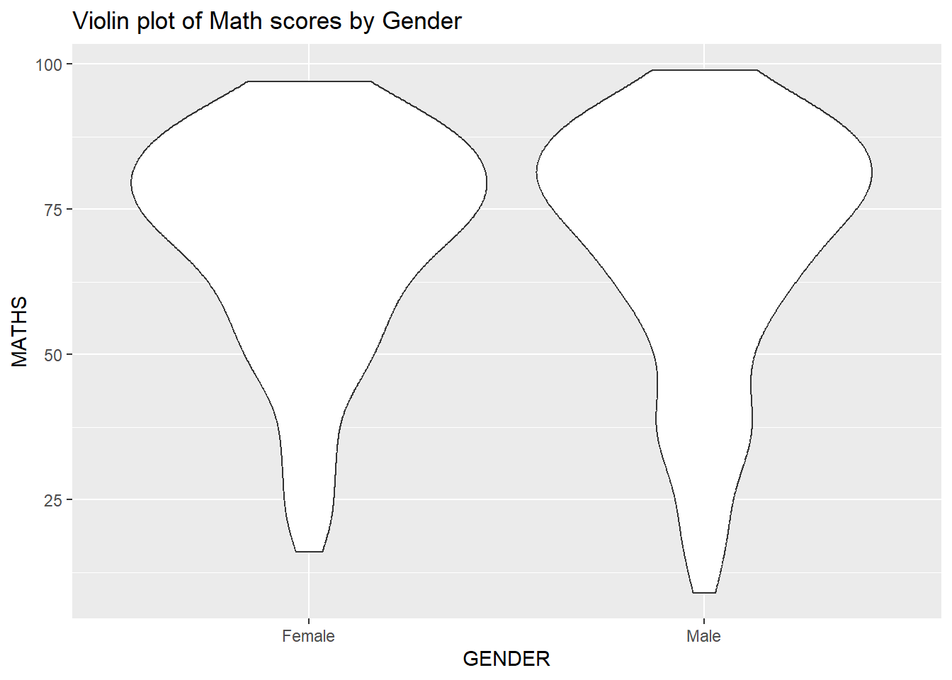
1.2.6 Scatter plot
ggplot(data=exam_data,
       aes(x= MATHS,
           y=ENGLISH)) +
  geom_point() +
  geom_smooth(method=lm,
              linewidth=0.5) +
  ggtitle("Scatter plot between Math and English scores")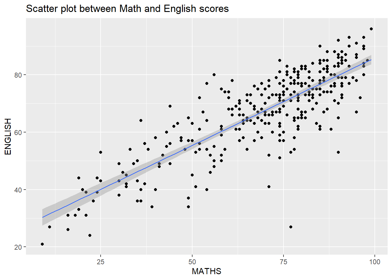
ggplot(data=exam_data,
       aes(x= MATHS, y=ENGLISH)) +
  geom_point() +
  geom_smooth(method=lm,
              size=0.5) +
  coord_cartesian(xlim=c(0,100),
                  ylim=c(0,100)) +
  ggtitle("Scatter plot between Math and English scores, equal axis")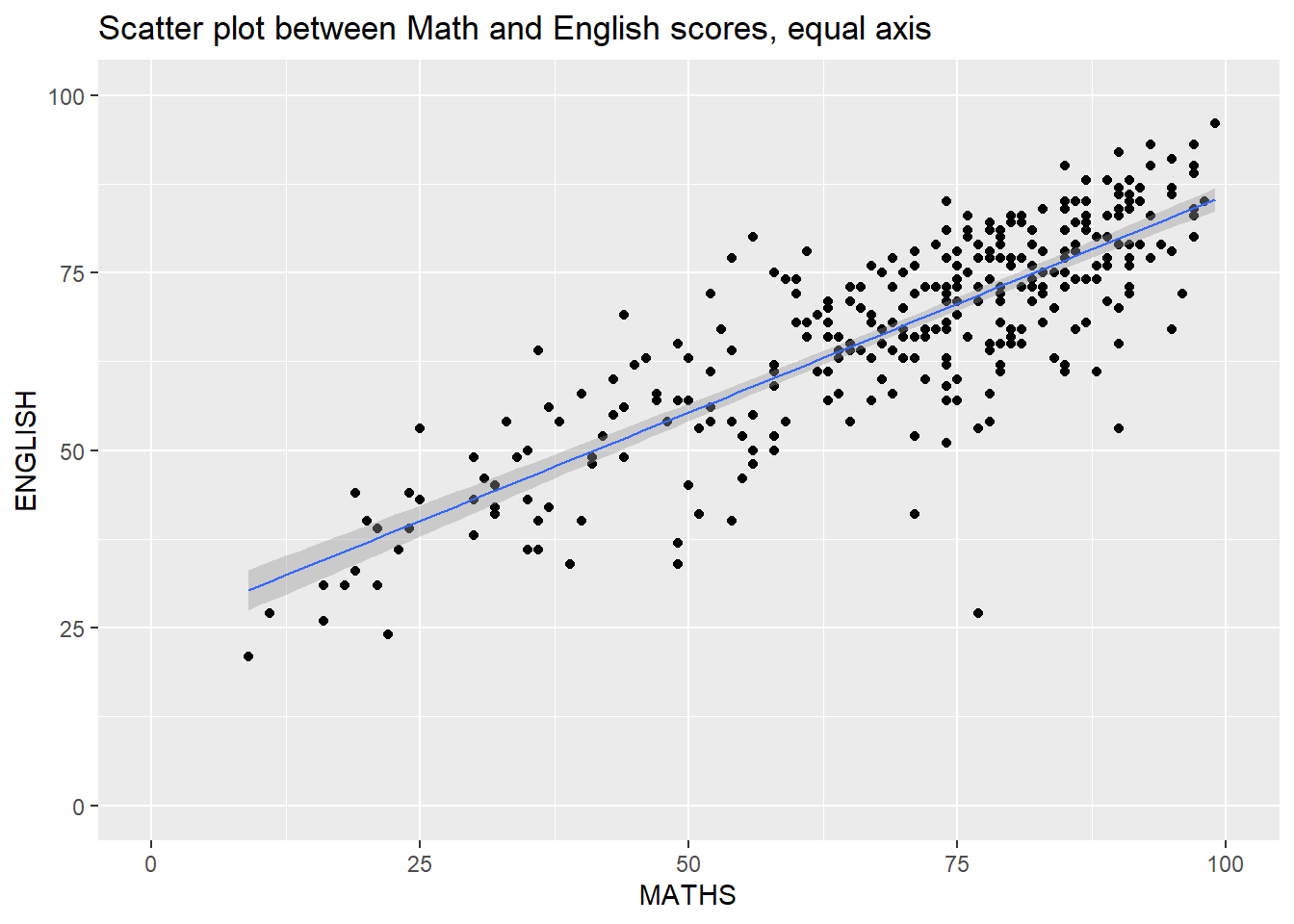
1.2.7 Combination chart types
ggplot(data=exam_data,
       aes(y = MATHS,
           x= GENDER)) +
  geom_boxplot() +
  geom_point(position="jitter",
             size = 0.5) +
  ggtitle("Scatter and box plots of Math scores by Gender")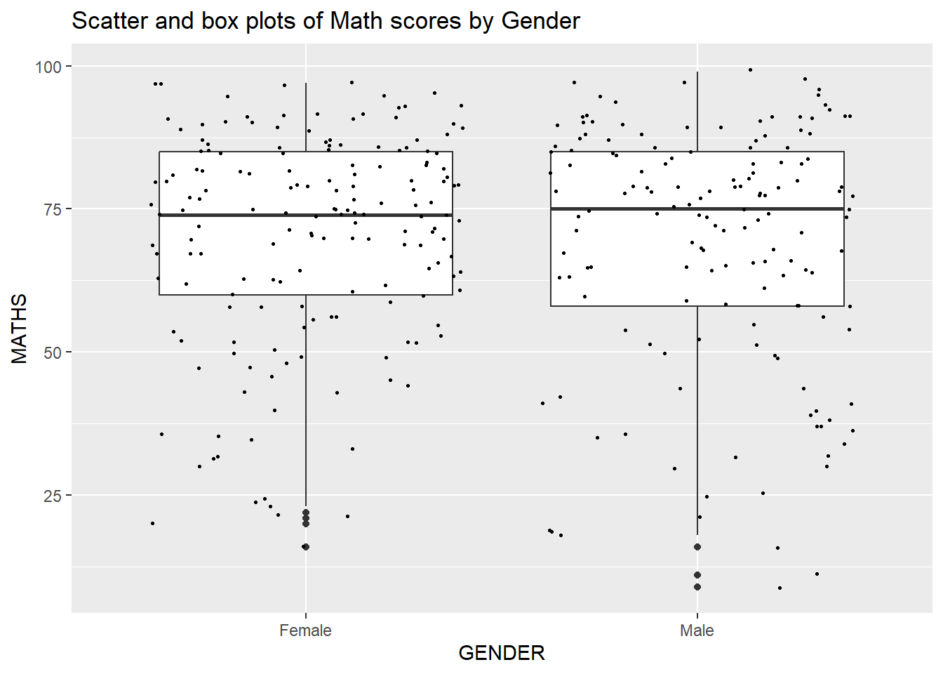
ggplot(data=exam_data,
       aes(y = MATHS, x= GENDER)) +
  geom_boxplot() +
  stat_summary(geom = "point",
               fun = "mean",
               colour ="red",
size=4) 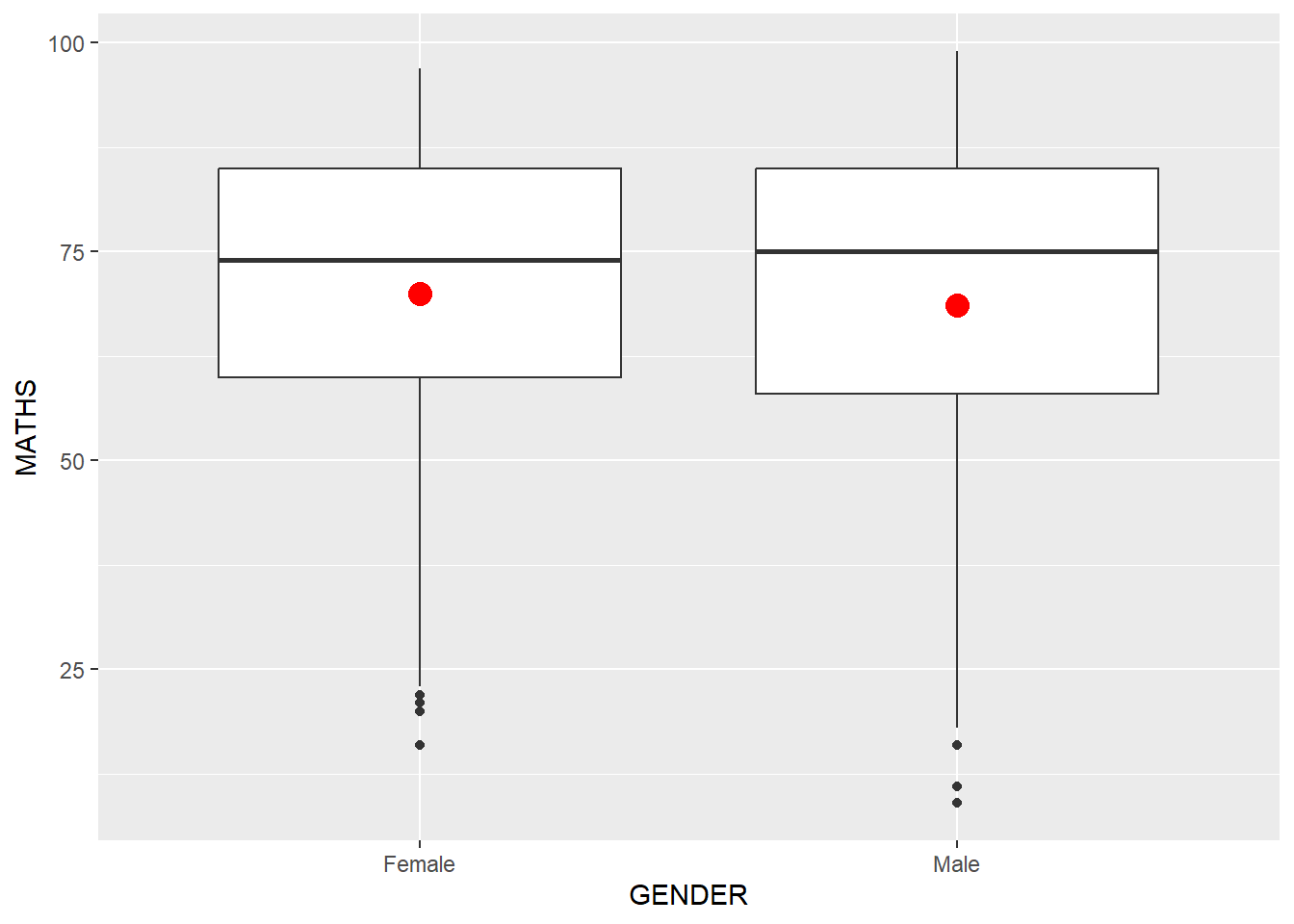
ggplot(data=exam_data,
       aes(x= MATHS)) +
  geom_histogram(bins=20) +
  facet_wrap(~ CLASS) +
  ggtitle("facet_wrap()")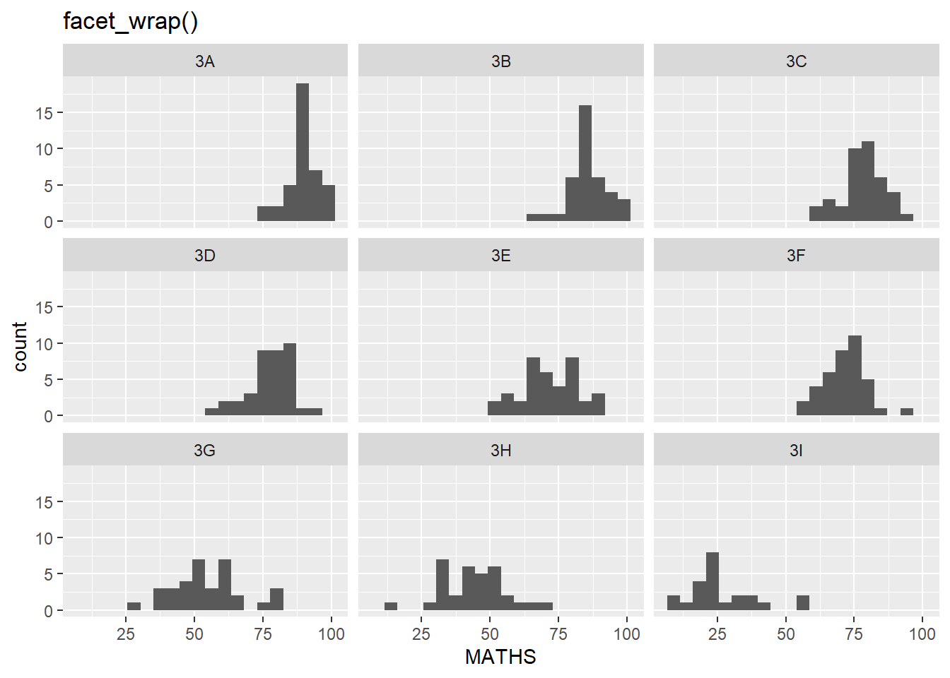
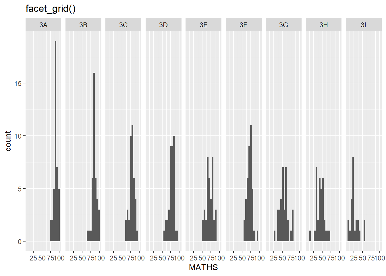
ggplot(data=exam_data,
       aes(x= MATHS)) +
  geom_histogram(bins=20) +
  facet_grid(~ CLASS) +
  ggtitle("facet_grid()")