
4 Programming Animated Statistical Graphics with R
4.1 Purpose
- How to create animated data visualisation by using gganimate and plotly r packages.
- How to reshape data by using tidyr package
- How to process, wrangle and transform data by using dplyr package.
After following me on this page, you can create this animated chart by yourself!
4.2 Terminology
When creating animations, the plot does not actually move. Instead, many individual plots are built and then stitched together as movie frames, just like an old-school flip book or cartoon. Each frame is a different plot when conveying motion, which is built using some relevant subset of the aggregate data. The subset drives the flow of the animation when stitched back together.
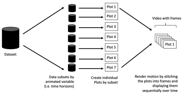
- Frame: In an animated line graph, each frame represents a different point in time or a different category. When the frame changes, the data points on the graph are updated to reflect the new data.
- Animation Attributes: The animation attributes are the settings that control how the animation behaves. For example, you can specify the duration of each frame, the easing function used to transition between frames, and whether to start the animation from the current frame or from the beginning.
4.3 Getting Started
4.3.1 Loading the R packages
- plotly, R library for plotting interactive statistical graphs.
- gganimate, an ggplot extension for creating animated statistical graphs.
- gifski converts video frames to GIF animations using pngquant’s fancy features for efficient cross-frame palettes and temporal dithering. It produces animated GIFs that use thousands of colors per frame.
- gapminder: An excerpt of the data available at Gapminder.org. We just want to use its country_colors scheme.
- tidyverse, a family of modern R packages specially designed to support data science, analysis and communication task including creating static statistical graphs.
pacman::p_load(readxl, gifski, gapminder,
               plotly, gganimate, tidyverse)
4.3.2 Importing the data
col <- c("Country", "Continent")
globalPop <- read_xls("data/GlobalPopulation.xls",
                      sheet="Data") %>%
  mutate(across(all_of(col), factor)) %>%
  mutate(Year = as.integer(Year))
NoteThings to learn
read_xls()of readxl package is used to import the Excel worksheet.mutateof dplyr package is used to modify/add data.mutate(across(all_of(col), factor))converts columns listed incolinto factors (categorical data). Old version ismutate_each_(funs(factor(.)), col). Can be use mutate_at(col, as.factor).s.integer(Year)— converts theYearcolumn to a whole number (integer).- %>% is pipe operator (from the
magrittr/tidyversepackage), meaning taking the result from the left and pass it into the next function.
head(globalPop, n = 10)# A tibble: 10 × 6
Country Year Young Old Population Continent
<fct> <int> <dbl> <dbl> <dbl> <fct>
1 Afghanistan 1996 83.6 4.5 21560. Asia
2 Afghanistan 1998 84.1 4.5 22913. Asia
3 Afghanistan 2000 84.6 4.5 23898. Asia
4 Afghanistan 2002 85.1 4.5 25268. Asia
5 Afghanistan 2004 84.5 4.5 28514. Asia
6 Afghanistan 2006 84.3 4.6 31057 Asia
7 Afghanistan 2008 84.1 4.6 32738. Asia
8 Afghanistan 2010 83.7 4.6 34505. Asia
9 Afghanistan 2012 82.9 4.6 36416. Asia
10 Afghanistan 2014 82.1 4.7 38327. Asia library(psych)
describe(globalPop) vars n mean sd median trimmed mad min
Country* 1 6204 111.47 64.07 111.0 111.47 83.03 1.0
Year 2 6204 2023.05 16.13 2024.0 2023.06 20.76 1996.0
Young 3 6204 41.66 20.22 34.3 39.00 15.42 15.5
Old 4 6204 17.93 13.57 12.8 15.93 10.53 1.0
Population 5 6204 34860.92 139208.84 5771.6 12001.51 8382.32 3.3
Continent* 6 6204 2.75 1.47 3.0 2.62 1.48 1.0
max range skew kurtosis se
Country* 222.0 221.0 0.00 -1.20 0.81
Year 2050.0 54.0 0.00 -1.20 0.20
Young 109.2 93.7 1.00 -0.01 0.26
Old 77.1 76.1 1.14 0.64 0.17
Population 1807878.6 1807875.3 9.10 90.28 1767.38
Continent* 6.0 5.0 0.53 -0.65 0.024.4 Animated Data Visualisation: gganimate methods
gganimate extends the grammar of graphics as implemented by ggplot2 to include the description of animation. It does this by providing a range of new grammar classes that can be added to the plot object in order to customise how it should change with time.
transition_*()defines how the data should be spread out and how it relates to itself across time.view_*()defines how the positional scales should change along the animation.shadow_*()defines how data from other points in time should be presented in the given point in time.enter_*()/exit_*()defines how new data should appear and how old data should disappear during the course of the animation.ease_aes()defines how different aesthetics should be eased during transitions.
4.4.1 Building a static population bubble plot
The basic ggplot2 functions are used to create a static bubble plot.
ggplot(globalPop, aes(x = Old, y = Young,
                      size = Population,
                      colour = Country)) +
  geom_point(alpha = 0.7,
             show.legend = FALSE) +
  scale_colour_manual(values = country_colors) +
  scale_size(range = c(2, 12)) +
  labs(title = 'Year: {frame_time}',
       x = '% Aged',
y = '% Young') 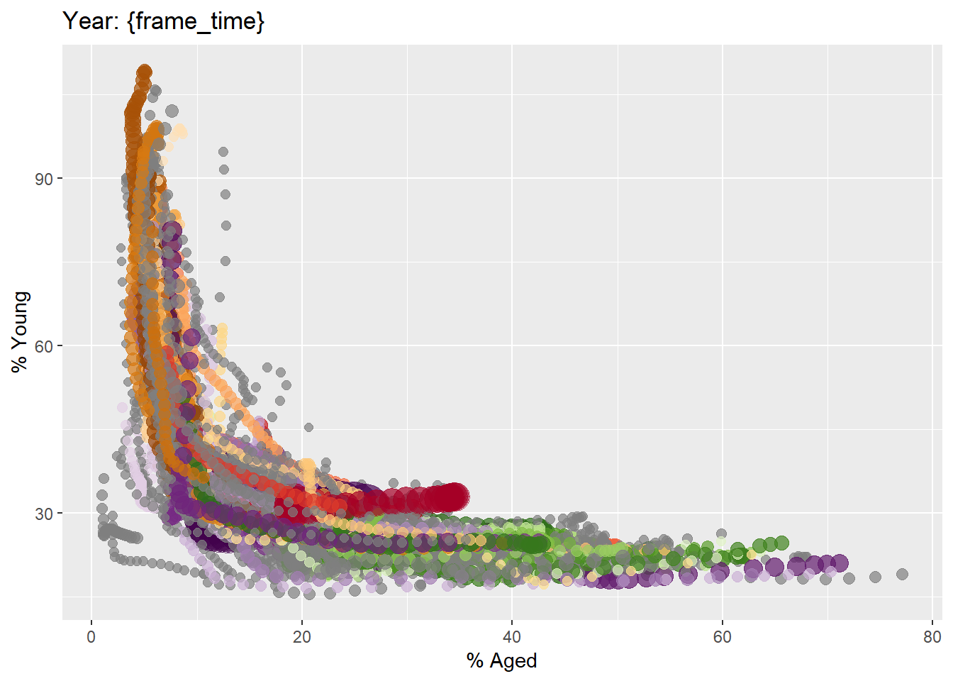
4.4.2 Building the animated bubble plot
transition_time()of gganimate is used to create transition through distinct states in time (i.e. Year).ease_aes()is used to control easing of aesthetics.
ggplot(globalPop, aes(x = Old, y = Young,
                      size = Population,
                      colour = Country)) +
  geom_point(alpha = 0.7,
             show.legend = FALSE) +
  scale_colour_manual(values = country_colors) +
  scale_size(range = c(2, 12)) +
  labs(title = 'Year: {frame_time}',
       x = '% Aged',
       y = '% Young') +
  transition_time(Year) +
ease_aes('linear') 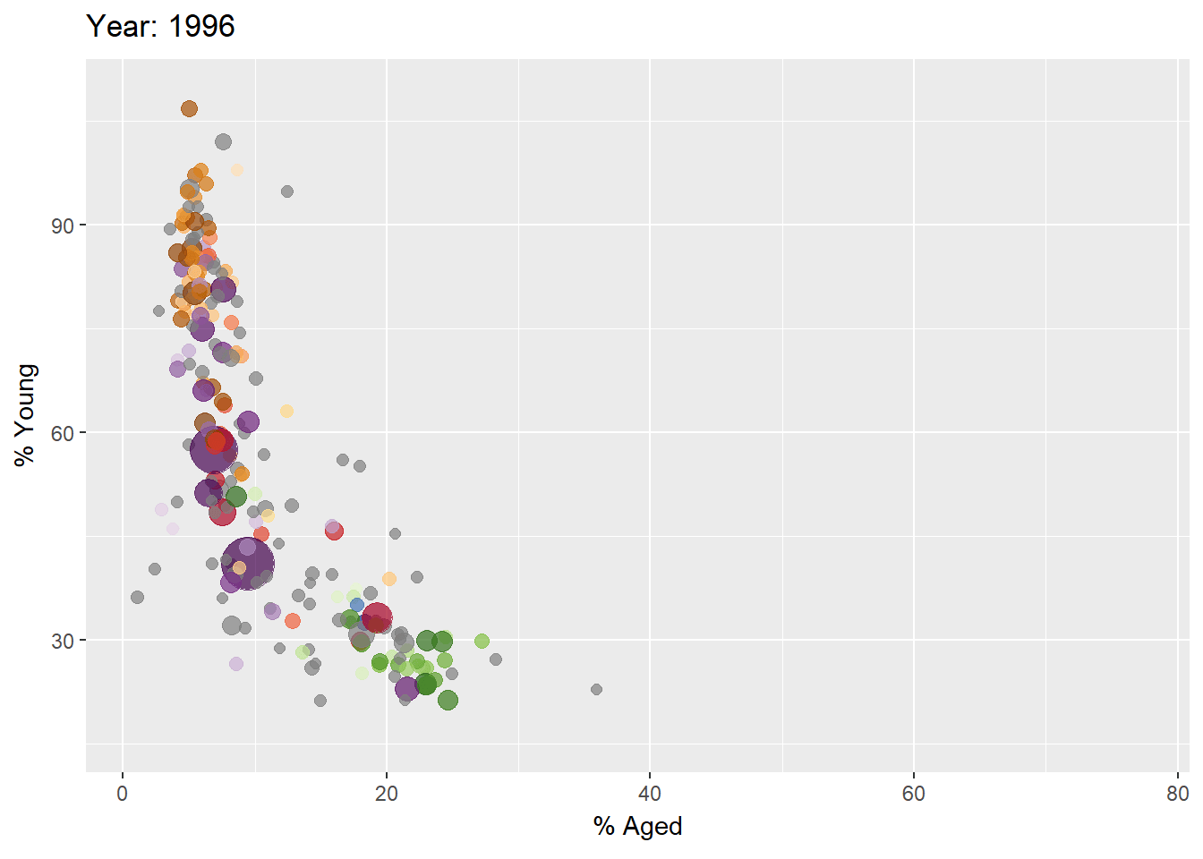
The default is linear. Other methods are: quadratic, cubic, quartic, quintic, sine, circular, exponential, elastic, back, and bounce. See demo here. I myself think they are all nice motions but not too different.
4.5 Animated Data Visualisation: plotly (ggplotly, plot_ly)
In Plotly R package, both ggplotly() and plot_ly() support key frame animations through the frame argument/aesthetic. They also support an ids argument/aesthetic to ensure smooth transitions between objects with the same id (which helps facilitate object constancy).
4.5.1 Building an animated bubble plot: ggplotly() method
Notice that although show.legend = FALSE argument was used, the legend still appears on the plot. To overcome this problem, theme(legend.position=‘none’) should be used.
gg <- ggplot(globalPop,
       aes(x = Old,
           y = Young,
           size = Population,
           colour = Country)) +
  geom_point(aes(size = Population,
                 frame = Year),
             alpha = 0.7) +
  scale_colour_manual(values = country_colors) +
  scale_size(range = c(2, 12)) +
  labs(x = '% Aged',
       y = '% Young') +
  theme(legend.position='none')

ggplotly(gg)
The animated bubble plot above includes a play/pause button and a slider component for controlling the animation.
NoteThings to learn
- Appropriate ggplot2 functions are used to create a static bubble plot. The output is then saved as an R object called gg.
ggplotly()is then used to convert the R graphic object into an animated svg object.
4.5.2 Building an animated bubble plot: plot_ly() method
bp <- globalPop %>%
  plot_ly(x = ~Old,
          y = ~Young,
          size = ~Population,
          color = ~Continent,
          sizes = c(2, 100),
          frame = ~Year,
          text = ~Country,
          hoverinfo = "text",
          type = 'scatter',
          mode = 'markers'
          ) %>%
  layout(showlegend = FALSE)
bp
Thank you for reaching here. Waiting for the next lesson!.