7 Visualising Uncertainty
7.1 Learning Outcome
Visualising uncertainty is relatively new in statistical graphics. In this chapter, you will gain hands-on experience on creating statistical graphics for visualising uncertainty. By the end of this chapter you will be able:
- to plot statistics error bars by using ggplot2,
- to plot interactive error bars by combining ggplot2, plotly and DT,
- to create advanced by using ggdist, and
- to create hypothetical outcome plots (HOPs) by using ungeviz package.
After reading this page, you can create Uncertainty visualization with Hypothetical Outcome Plots as below.
7.2 Getting Started
7.2.1 Installing and loading the packages
For the purpose of this exercise, the following R packages will be used, they are:
- tidyverse, a family of R packages for data science process,
- plotly for creating interactive plot,
- gganimate for creating animation plot,
- DT for displaying interactive html table,
- crosstalk for for implementing cross-widget interactions (currently, linked brushing and filtering), and
- ggdist for visualising distribution and uncertainty.
pacman::p_load(plotly, crosstalk, DT,
               ggdist, ggridges, colorspace,
               gganimate, tidyverse,
               ggplot)
7.2.2 Data import
For the purpose of this exercise, Exam_data.csv will be used.
exam <- read_csv("data/Exam_data.csv")7.3 Visualizing the uncertainty of point estimates: ggplot2 methods
A point estimate is a single number, such as a mean. Uncertainty, on the other hand, is expressed as standard error, confidence interval, or credible interval.
Important
Don’t confuse the uncertainty of a point estimate with the variation in the sample.
In this section, you will learn how to plot error bars of maths scores by race by using data provided in exam tibble data frame.
Firstly, code chunk below will be used to derive the necessary summary statistics.
my_sum <- exam %>%
  group_by(RACE) %>%
  summarise(
    n=n(),
    mean=mean(MATHS),
    sd=sd(MATHS)
    ) %>%
  mutate(se=sd/sqrt(n-1))
TipThings to learn
- group_by() of dplyr package is used to group the observation by RACE
- summarise() is used to compute the count of observations, mean, standard deviation
- mutate() is used to derive standard error of Maths by RACE
- the output is save as a tibble data table called my_sum.
Next, the code chunk below will be used to display my_sum tibble data frame in an html table format.
knitr::kable(head(my_sum), format = 'html')| RACE | n | mean | sd | se |
|---|---|---|---|---|
| Chinese | 193 | 76.50777 | 15.69040 | 1.132357 |
| Indian | 12 | 60.66667 | 23.35237 | 7.041005 |
| Malay | 108 | 57.44444 | 21.13478 | 2.043177 |
| Others | 9 | 69.66667 | 10.72381 | 3.791438 |
7.3.1 Plotting standard error bars of point estimates
Now we are ready to plot the standard error bars of mean maths score by race as shown below.
ggplot(my_sum) +
  geom_errorbar(
    aes(x=RACE,
        ymin=mean-se,
        ymax=mean+se),
    width=0.2,
    colour="black",
    alpha=0.9,
    linewidth=0.5) +
  geom_point(aes
           (x=RACE,
            y=mean),
           stat="identity",
           color="red",
           size = 1.5,
           alpha=1) +
  ggtitle("Standard error of mean maths score by rac")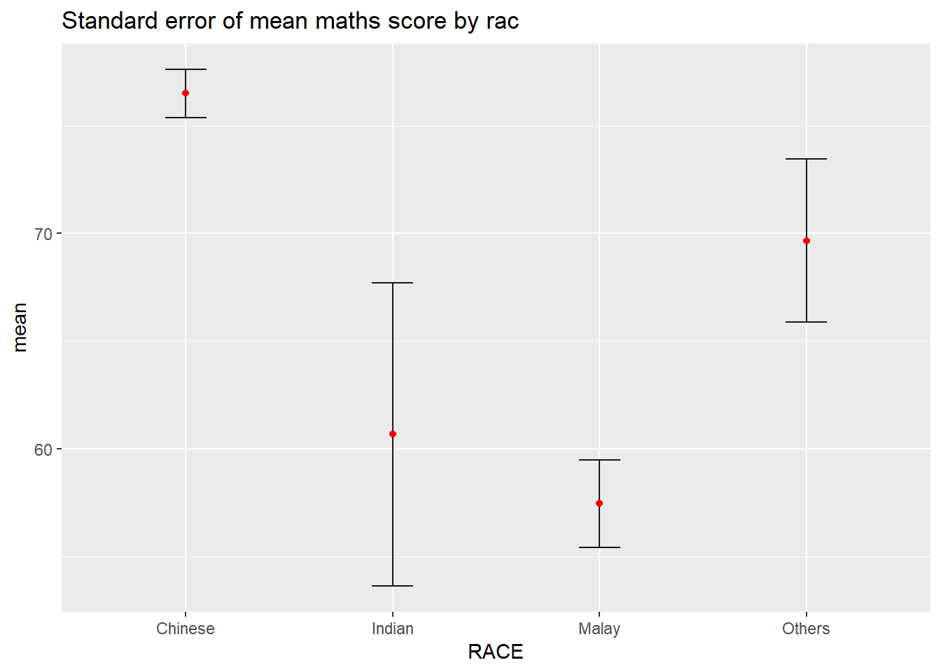
7.3.2 Plotting confidence interval of point estimates
Instead of plotting the standard error bar of point estimates, we can also plot the confidence intervals of mean maths score by race.
ggplot(my_sum) +
  geom_errorbar(
    aes(x=reorder(RACE, -mean),
        ymin=mean-1.96*se,
        ymax=mean+1.96*se),
    width=0.2,
    colour="black",
    alpha=0.9,
    linewidth=0.5) +
  geom_point(aes
           (x=RACE,
            y=mean),
           stat="identity",
           color="red",
           size = 1.5,
           alpha=1) +
  labs(x = "Maths score",
       title = "95% confidence interval of mean maths score by race")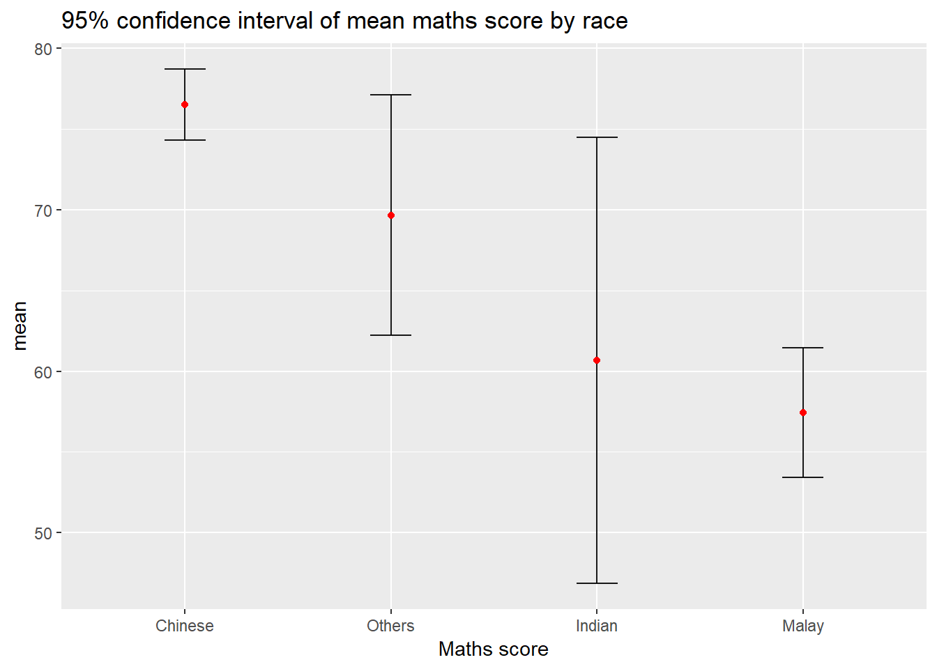
7.3.3 Visualizing the uncertainty of point estimates with interactive error bars
In this section, you will learn how to plot interactive error bars for the 99% confidence interval of mean maths score by race as shown in the figure below.
shared_df = SharedData$new(my_sum)

bscols(widths = c(4,8), #Creates a two-column layout — left column takes 4/12 width (plot), right column takes 8/12 width (table)
       ggplotly((ggplot(shared_df) +
                   geom_errorbar(aes(
                  x=reorder(RACE, -mean),   # sort races from highest-lowest mean
                  ymin=mean-2.58*se,        # lower bound of 99% CI
                  ymax=mean+2.58*se),       # upper bound of 99% CI
                  width=0.2,                # width of the error bar caps
                  colour="black",           # bar color
                  alpha=0.9,                # slight transparency
                  size=0.5) +               # bar thickness
                   geom_point(aes(
                     x=RACE,
                     y=mean,
                     text = paste("Race:", `RACE`,  # hover tooltip line 1
                                  "<br>N:", `n`,    # hover tooltip line 2
                                 "<br>Avg. Scores:", round(mean, digits=2),# hover tooltip line 3
                                 "<br>95% CI:[",   # hover tooltip line 4
                                  round((mean-2.58*se), digits = 2), ",",
                                  round((mean+2.58*se), digits = 2),"]")),
                    stat="identity",          # use values as-is
                    color="red",              # red dots
                    size=1.5,                 # dot size
                    alpha=1) +                # fully opaque
                   xlab("Race") +
                   ylab("Average Scores") +
                   theme_minimal() +
                   theme(axis.text.x = element_text(
                      angle = 45,           # rotate x labels 45 degrees
                      vjust = 0.5,          # vertical adjustment
                      hjust=1),             # horizontal adjustment
                      xis.text = element_text(size = 7),# x and y axis tick labels
                      axis.title = element_text(size = 8),# "Race"+"Average Scores"
                      plot.title = element_text(size = 8)) +# chart title

                   ggtitle("99% Confidence interval of average /<br>maths scores by race")),
                tooltip = "text"),
       DT::datatable(shared_df,            # use same shared data (linked to plot)
                rownames = FALSE,          # hide row numbers
                class="compact display",           # compact table style
                width="100%",              # full width
                options = list(
                  pageLength = 10,         # show 10 rows per page
                  scrollX=T),              # enable horizontal scrolling
                colnames = c("No. of pupils", # rename column headers
                             "Avg Scores",
                             "Std Dev",
                             "Std Error")) %>%
         formatRound(columns=c('mean', 'sd', 'se'),
                     digits=2))
7.4 Visualising Uncertainty: ggdist package
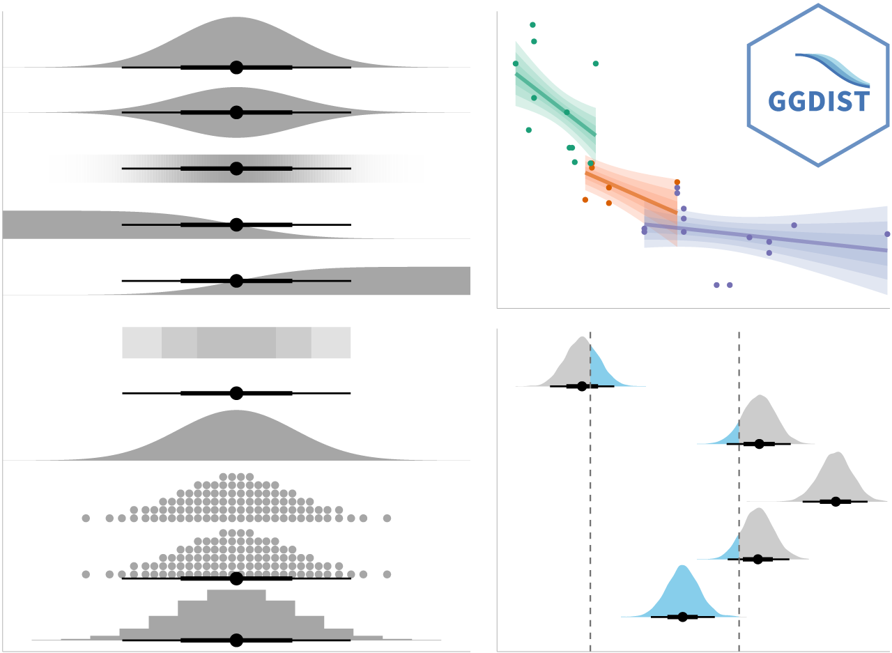
ggdist is an R package that provides a flexible set of ggplot2 geoms and stats designed especially for visualising distributions and uncertainty.
It is designed for both frequentist and Bayesian uncertainty visualization, taking the view that uncertainty visualization can be unified through the perspective of distribution visualization:
- for frequentist models, one visualises confidence distributions or bootstrap distributions (see vignette(“freq-uncertainty-vis”));
- for Bayesian models, one visualises probability distributions (see the tidybayes package, which builds on top of ggdist).
7.4.1 Visualizing the uncertainty of point estimates: ggdist methods, pointinterval
In the code chunk below, stat_pointinterval() of ggdist is used to build a visual for displaying distribution of maths scores by race.
exam %>%
  ggplot(aes(x = RACE,
             y = MATHS)) +
  stat_pointinterval() +
  labs(
    title = "Visualising confidence intervals of mean math score",
    subtitle = "Mean Point + Multiple-interval plot")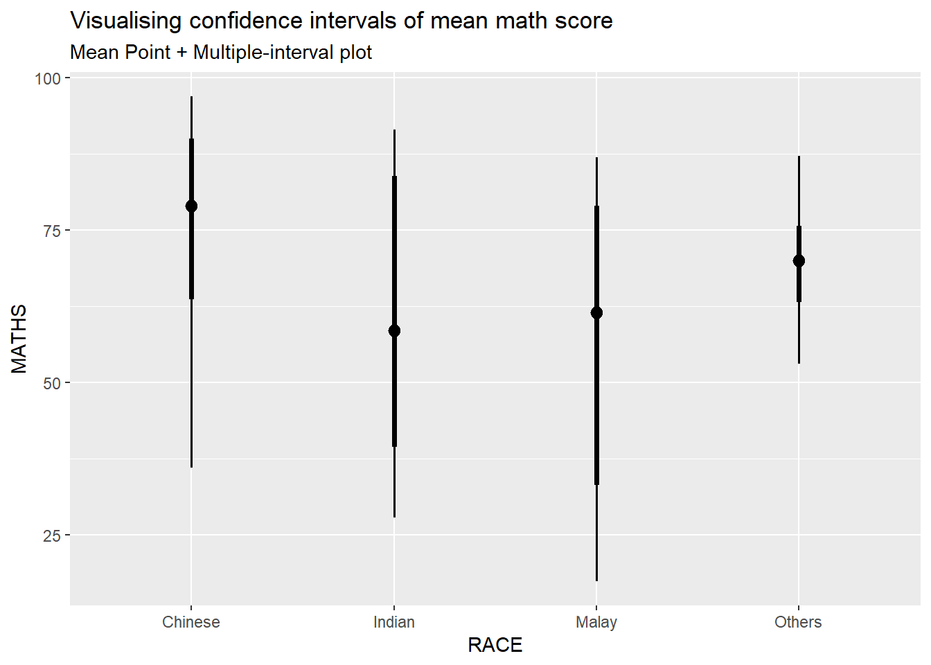
How to show 95% and 99% confidence intervals?
exam %>%
  ggplot(aes(x = RACE,
             y = MATHS)) +
  stat_pointinterval(
    .width = c(0.95, 0.99),
    show.legend = TRUE) +
  labs(
    title = "Visualising confidence intervals of mean math score",
    subtitle = "Mean Point + Multiple-interval plot")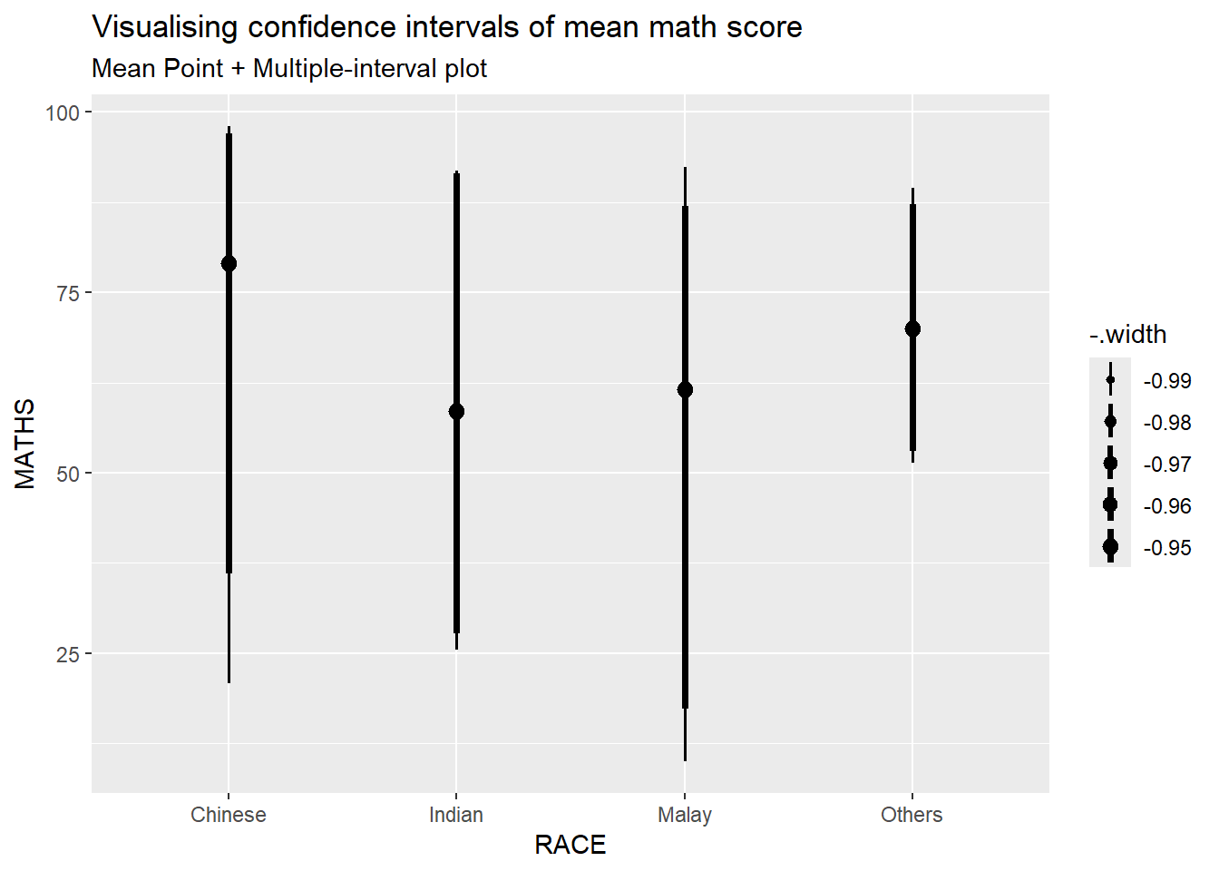
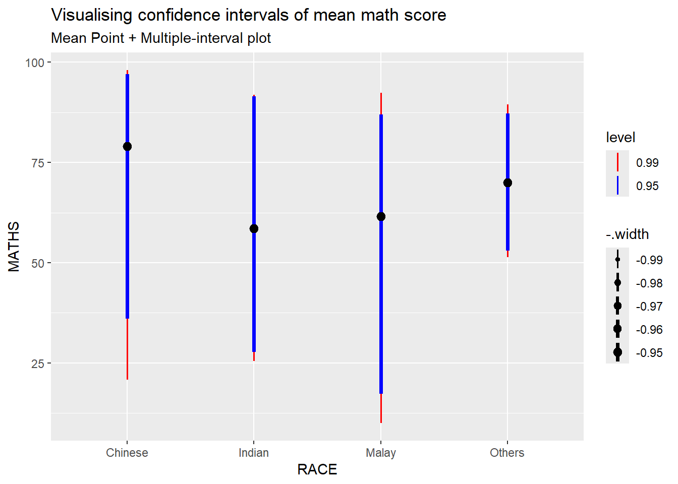
Add color to differentiate 0.95 and 0.99 interval
exam %>%
  ggplot(aes(x = RACE, y = MATHS)) +
  stat_pointinterval(
    .width = c(0.95, 0.99),
    aes(interval_color = after_stat(level)),
    show.legend = TRUE) +
  scale_color_manual(
    values = c("0.95" = "blue",
               "0.99" = "red"),
    aesthetics = "interval_color") +
  labs(
    title = "Visualising confidence intervals of mean math score",
    subtitle = "Mean Point + Multiple-interval plot"
    )
7.4.2 Visualizing the uncertainty of point estimates: ggdist methods, gradientinterval
In the code chunk below, stat_gradientinterval() of ggdist is used to build a visual for displaying distribution of maths scores by race.
exam %>%
  ggplot(aes(x = RACE,
             y = MATHS)) +
  stat_gradientinterval(
    fill = "skyblue",
    show.legend = TRUE
  ) +
  labs(
    title = "Visualising confidence intervals of mean math score",
    subtitle = "Gradient + interval plot")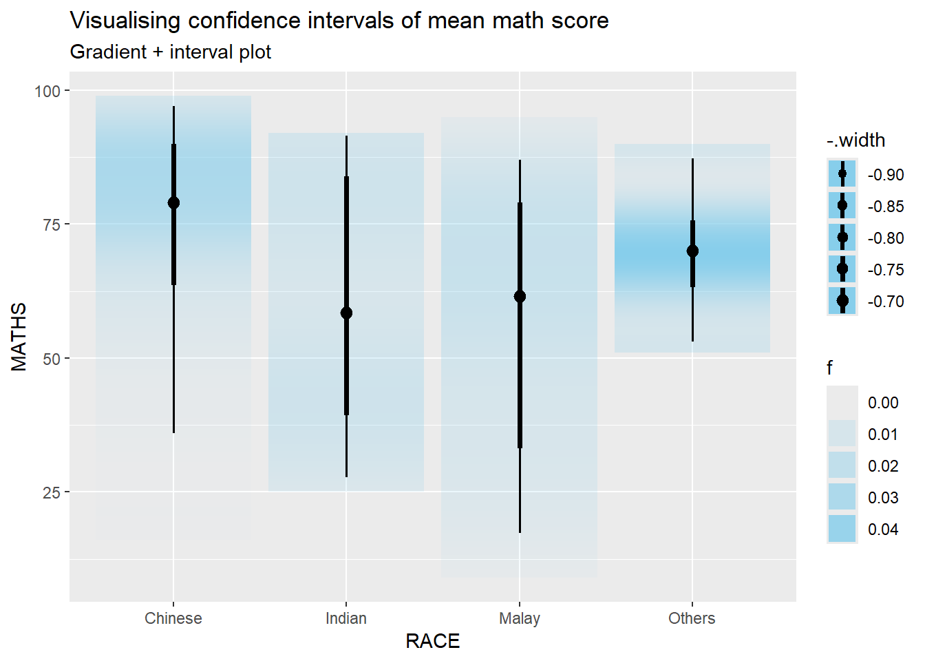
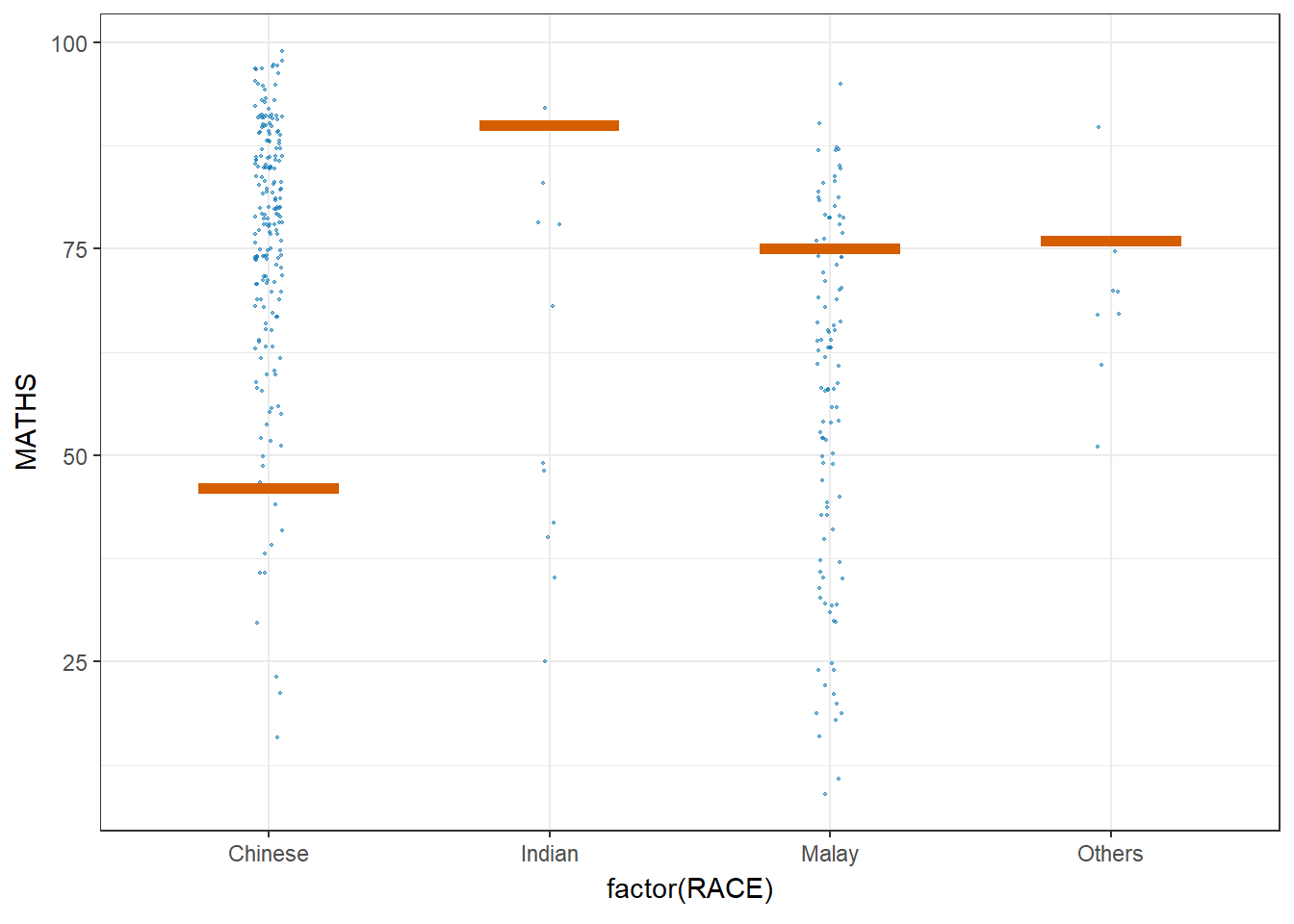
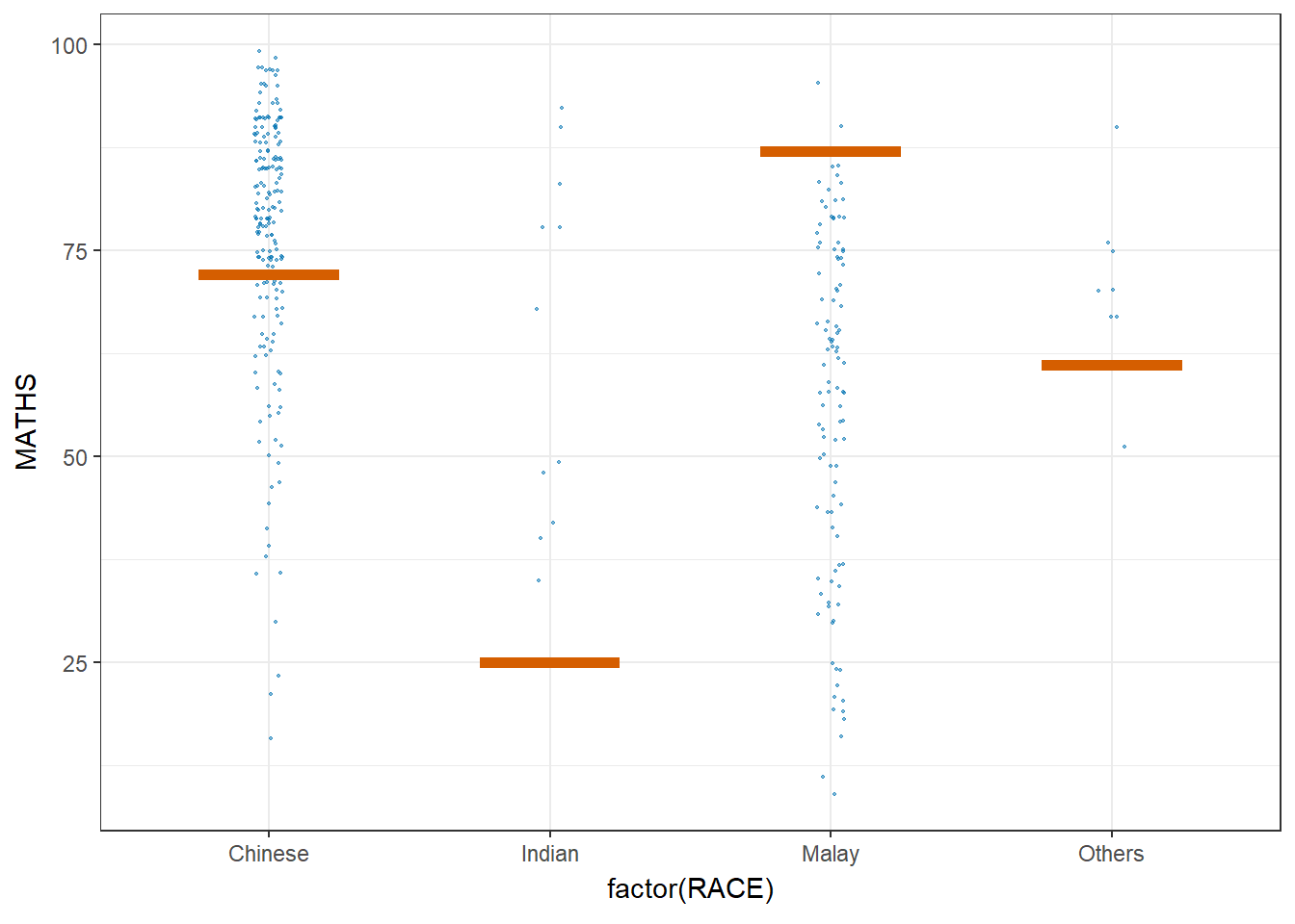
7.5 Visualising Uncertainty with Hypothetical Outcome Plots (HOPs)
11.5.1 Installing & launch ungeviz package
Note: You only need to perform this step once.
devtools::install_github("wilkelab/ungeviz")
library(ungeviz)7.5.3 Visualising Uncertainty with Hypothetical Outcome Plots (HOPs)
Next, the code chunk below will be used to build the HOPs.
ggplot(data = exam,
       (aes(x = factor(RACE),
            y = MATHS))) +
  geom_point(position = position_jitter(
    height = 0.3,
    width = 0.05),
    size = 0.4,
    color = "#0072B2",
    alpha = 1/2) +
  geom_hpline(data = sampler(25,
                             group = RACE),
              height = 0.6,
              color = "#D55E00") +
  theme_bw() +
  transition_states(.draw, 1, 3)