pacman::p_load(tidyverse, FunnelPlotR, plotly, knitr)8 Funnel Plots for Fair Comparisons
8.1 Overview
Funnel plot is a specially designed data visualisation for conducting unbiased comparison between outlets, stores or business entities. By the end of this hands-on exercise, you will gain hands-on experience on:
- plotting funnel plots by using funnelPlotR package,
- plotting static funnel plot by using ggplot2 package, and
- plotting interactive funnel plot by using both plotly R and ggplot2 packages.
8.2 Installing and Launching R Packages
In this exercise, four R packages will be used. They are:
- readr for importing csv into R.
- FunnelPlotR for creating funnel plot.
- ggplot2 for creating funnel plot manually.
- knitr for building static html table.
- plotly for creating interactive funnel plot.
In this section, COVID-19_DKI_Jakarta will be used. The data was downloaded from Open Data Covid-19 Provinsi DKI Jakarta portal. For this hands-on exercise, we are going to compare the cumulative COVID-19 cases and death by sub-district (i.e. kelurahan) as at 31st July 2021, DKI Jakarta.
The code chunk below imports the data into R and save it into a tibble data frame object called covid19.
covid19 <- read_csv("data/COVID-19_DKI_Jakarta.csv") %>%
mutate_if(is.character, as.factor)head(covid19, n = 10)# A tibble: 10 × 7
`Sub-district ID` City District `Sub-district` Positive Recovered Death
<dbl> <fct> <fct> <fct> <dbl> <dbl> <dbl>
1 3172051003 JAKARTA U… PADEMAN… ANCOL 1776 1691 26
2 3173041007 JAKARTA B… TAMBORA ANGKE 1783 1720 29
3 3175041005 JAKARTA T… KRAMAT … BALE KAMBANG 2049 1964 31
4 3175031003 JAKARTA T… JATINEG… BALI MESTER 827 797 13
5 3175101006 JAKARTA T… CIPAYUNG BAMBU APUS 2866 2792 27
6 3174031002 JAKARTA S… MAMPANG… BANGKA 1828 1757 26
7 3175051002 JAKARTA T… PASAR R… BARU 2541 2433 37
8 3175041004 JAKARTA T… KRAMAT … BATU AMPAR 3608 3445 68
9 3171071002 JAKARTA P… TANAH A… BENDUNGAN HIL… 2012 1937 38
10 3175031002 JAKARTA T… JATINEG… BIDARA CINA 2900 2773 528.4 FunnelPlotR methods
FunnelPlotR package uses ggplot to generate funnel plots. It requires a numerator (events of interest), denominator (population to be considered) and group. The key arguments selected for customisation are:
limit: plot limits (95 or 99).label_outliers: to label outliers (true or false).Poisson_limits: to add Poisson limits to the plot.OD_adjust: to add overdispersed limits to the plot.xrangeandyrange: to specify the range to display for axes, acts like a zoom function.- Other aesthetic components such as graph title, axis labels etc.
8.4.1 FunnelPlotR methods: The basic plot
The code chunk below plots a funnel plot.
funnel_plot(
  .data = covid19,
  numerator = Positive,
  denominator = Death,
  group = `Sub-district`
)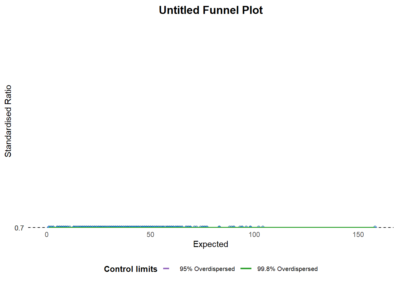
A funnel plot object with 267 points of which 0 are outliers.
Plot is adjusted for overdispersion.
A funnel plot object with 267 points of which 0 are outliers. Plot is adjusted for overdispersion.
NoteThings to learn
groupin this function is different from the scatterplot. Here, it defines the level of the points to be plotted i.e. Sub-district, District or City. If Cityc is chosen, there are only six data points.- By default,
data_typeargument is “SR”. limit: Plot limits, accepted values are: 95 or 99, corresponding to 95% or 99.8% quantiles of the distribution.
8.4.2 FunnelPlotR methods: Makeover 1
The code chunk below plots a funnel plot.
funnel_plot(
  .data = covid19,
  numerator = Death,
  denominator = Positive,
  group = `Sub-district`,
  data_type = "PR",     #<<
  xrange = c(0, 6500),  #<<
  yrange = c(0, 0.05)   #<<
)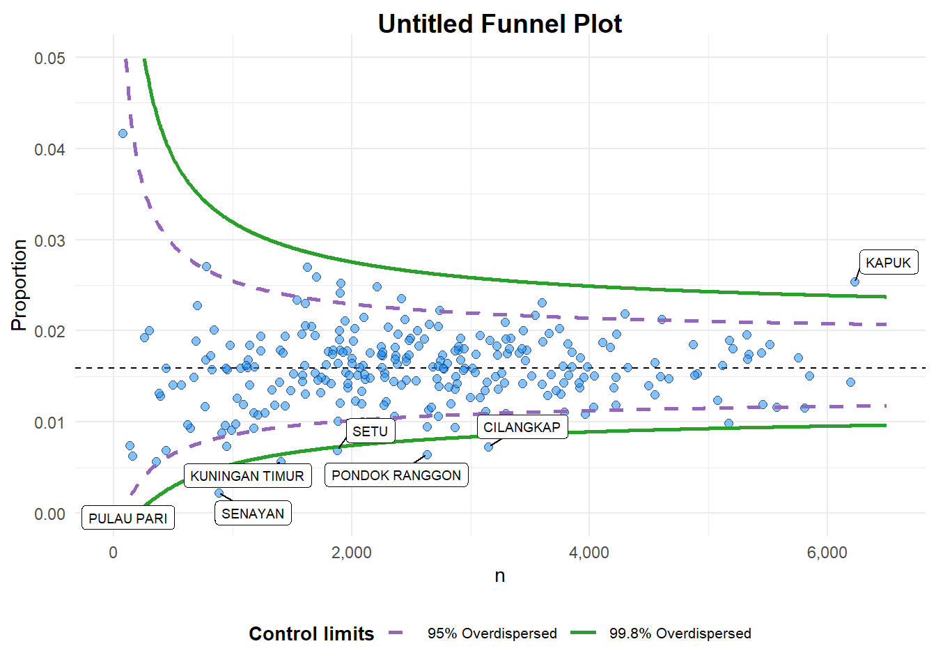
A funnel plot object with 267 points of which 7 are outliers.
Plot is adjusted for overdispersion.
A funnel plot object with 267 points of which 7 are outliers. Plot is adjusted for overdispersion.
NoteWhat we have changed
- data_type argument is used to change from default “SR” to “PR” (i.e. proportions).
- xrange and yrange are used to set the range of x-axis and y-axis
8.4.3 FunnelPlotR methods: Makeover 2
The code chunk below plots a funnel plot.
funnel_plot(
  .data = covid19,
  numerator = Death,
  denominator = Positive,
  group = `Sub-district`,
  data_type = "PR",
  xrange = c(0, 6500),
  yrange = c(0, 0.05),
  label = NA,
  title = "Cumulative COVID-19 Fatality Rate by Cumulative Total Number of COVID-19 Positive Cases", #<<
  x_label = "Cumulative COVID-19 Positive Cases", #<<
  y_label = "Cumulative Fatality Rate"  #<<
)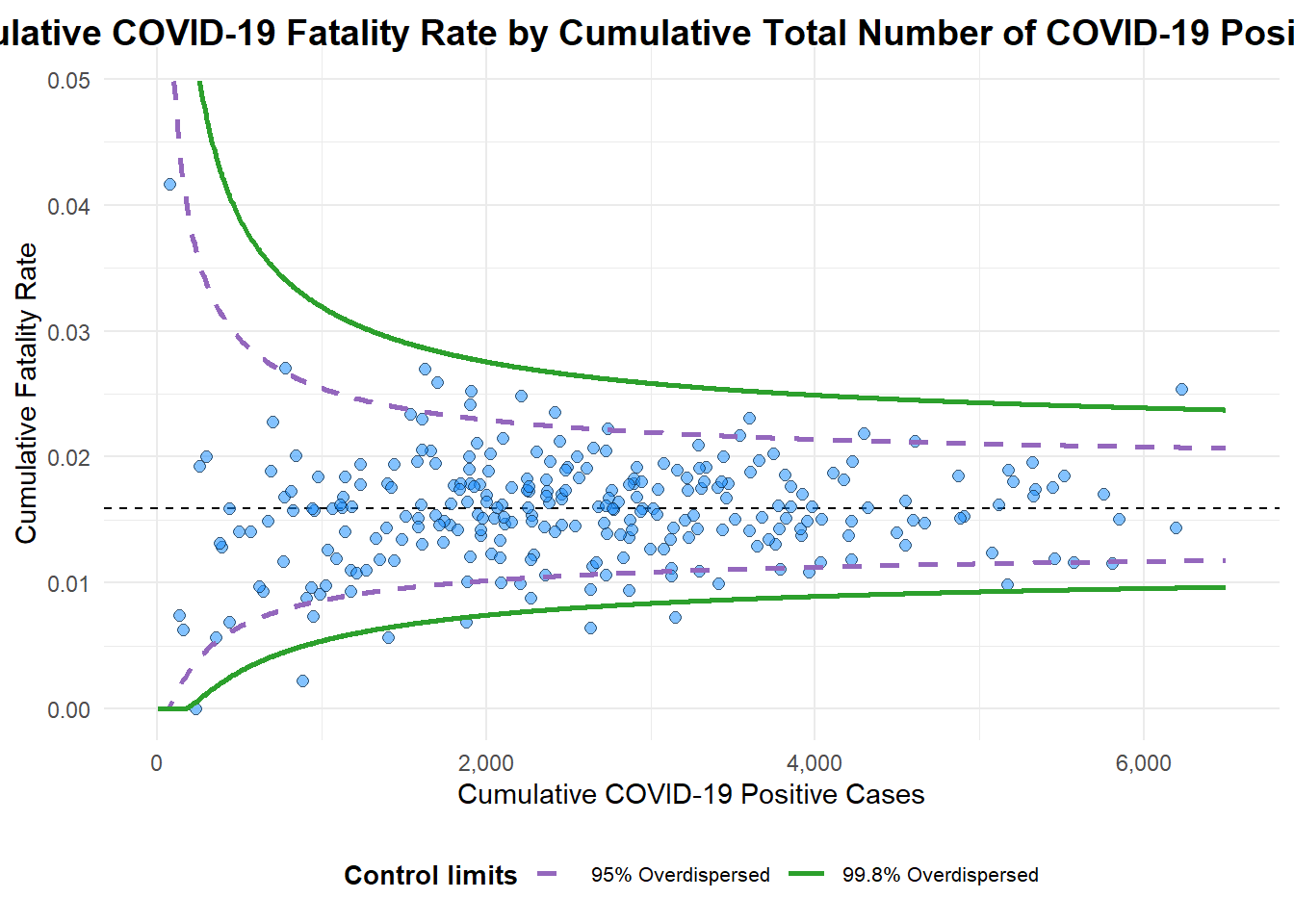
A funnel plot object with 267 points of which 7 are outliers.
Plot is adjusted for overdispersion.
What we have added
label = NAargument is to removed the default label outliers feature.titleargument is used to add plot title.x_labelandy_labelarguments are used to add/edit x-axis and y-axis titles.
8.5 Funnel Plot for Fair Visual Comparison: ggplot2 methods
In this section, you will gain hands-on experience on building funnel plots step-by-step by using ggplot2. It aims to enhance you working experience of ggplot2 to customise speciallised data visualisation like funnel plot.
8.5.1 Computing the basic derived fields
To plot the funnel plot from scratch, we need to derive cumulative death rate and standard error of cumulative death rate.
df <- covid19 %>%
  mutate(rate = Death / Positive) %>%
  mutate(rate.se = sqrt((rate*(1-rate)) / (Positive))) %>%
  filter(rate > 0)
Next, the fit.mean is computed by using the code chunk below.
fit.mean <- weighted.mean(df$rate, 1/df$rate.se^2)8.5.2 Calculate lower and upper limits for 95% and 99.9% CI
The code chunk below is used to compute the lower and upper limits for 95% confidence interval.
number.seq <- seq(1, max(df$Positive), 1)
number.ll95 <- fit.mean - 1.96 * sqrt((fit.mean*(1-fit.mean)) / (number.seq))
number.ul95 <- fit.mean + 1.96 * sqrt((fit.mean*(1-fit.mean)) / (number.seq))
number.ll999 <- fit.mean - 3.29 * sqrt((fit.mean*(1-fit.mean)) / (number.seq))
number.ul999 <- fit.mean + 3.29 * sqrt((fit.mean*(1-fit.mean)) / (number.seq))
dfCI <- data.frame(number.ll95, number.ul95, number.ll999,
                   number.ul999, number.seq, fit.mean)
8.5.3 Plotting a static funnel plot
In the code chunk below, ggplot2 functions are used to plot a static funnel plot.
p <- ggplot(df, aes(x = Positive, y = rate)) +
  geom_point(aes(label = `Sub-district`,
                 color = rate),
             alpha = 0.4) +

  scale_color_gradient(                # adjust color
            low = "green",
            high = "red",
            name = "Fatality Rate") +

  geom_line(data = dfCI,
            aes(x = number.seq,
                y = number.ll95),
            size = 0.4,
            colour = "grey40",
            linetype = "dashed") +
  geom_line(data = dfCI,
            aes(x = number.seq,
                y = number.ul95),
            size = 0.4,
            colour = "grey40",
            linetype = "dashed") +
  geom_line(data = dfCI,
            aes(x = number.seq,
                y = number.ll999),
            size = 0.4,
            colour = "grey40") +
  geom_line(data = dfCI,
            aes(x = number.seq,
                y = number.ul999),
            size = 0.4,
            colour = "grey40") +
  geom_hline(data = dfCI,
             aes(yintercept = fit.mean),
             size = 0.4,
             colour = "grey40") +
  coord_cartesian(ylim=c(0,0.05)) +
  annotate("text", x = 1, y = -0.13, label = "95%", size = 3, colour = "grey40") +
  annotate("text", x = 4.5, y = -0.18, label = "99%", size = 3, colour = "grey40") +
  ggtitle("Cumulative Fatality Rate by Cumulative Number of COVID-19 Cases") +
  xlab("Cumulative Number of COVID-19 Cases") +
  ylab("Cumulative Fatality Rate") +
  theme_light() +
  theme(plot.title = element_text(size=12),
        legend.position = c(0.91,0.85),
        legend.title = element_text(size=7),
        legend.text = element_text(size=7),
        legend.background = element_rect(colour = "grey60", linetype = "dotted"),
        legend.key.height = unit(0.3, "cm"))
p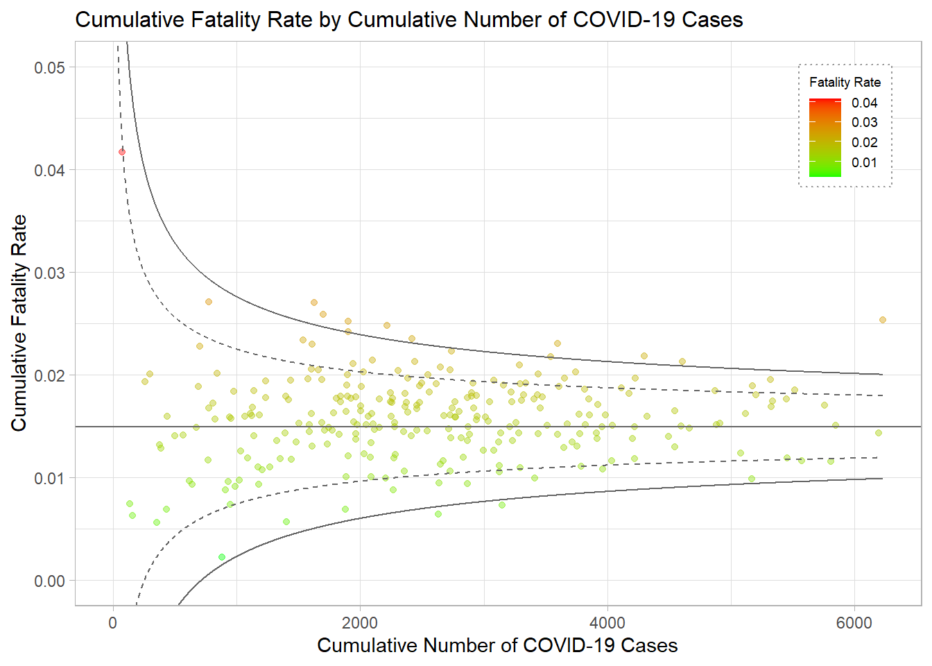
8.5.4 Interactive Funnel Plot: plotly + ggplot2
The funnel plot created using ggplot2 functions can be made interactive with ggplotly() of plotly r package.
fp_ggplotly <- ggplotly(p,
  tooltip = c("label",
              "x",
              "y"))
fp_ggplotly
After using both FunnelPlotR and ggplot2 to draw Funnel Plots, I wonder why FunnelPlotR is easy and fast to implement than ggplot2, why should we still study ggplot2 here? I think some of reasons and their different applications are:
- Use FunnelPlotR when I want results fast with correct methodology, but hard to customize beyond package offers.
- Use ggplot2 when I need customization or want to understand/show the underlying calculations, despite of manual calculation and steeper learning curve.